
How to Make a Branded Letterhead (What to Include + Free Template)
Quick Answer
A branded letterhead needs a restrained logo or business name in the header, clear contact details in the footer, and enough blank space for the letter itself. Keep the design at least 0.5 inches (13 mm) from the page edge, use an SVG logo as your source file, and test one printed page before sending a proposal or quote.
A branded letterhead should make a proposal or quote feel like it came from the same business as your website, without turning every page into an advert.
Use one when you send formal PDFs, proposals, quotes, contracts, or client letters often enough that a plain document feels unfinished. If nearly all of your work happens in short emails or invoices generated by your accounting software, it can wait. Letterhead is a supporting piece of a brand kit, not a launch requirement for every business.
What a branded letterhead needs
You only need a few things:
- Your logo, business name, or both
- A website, email address, phone number, or the contact details clients actually use
- One or two brand colors, used sparingly
- A font that is easy to read in a long document
- Blank space for the date, recipient, message, and signature
Pick the contact details that help the recipient act next. A consultant may need a website and email. A local trade business may need a phone number. There is no prize for fitting every social profile, service list, and sales message into the footer.
What goes where
Keep the page quiet. The reader should find your name and contact details at a glance, then get on with the document.
| Area | Put this there | Keep in mind |
|---|---|---|
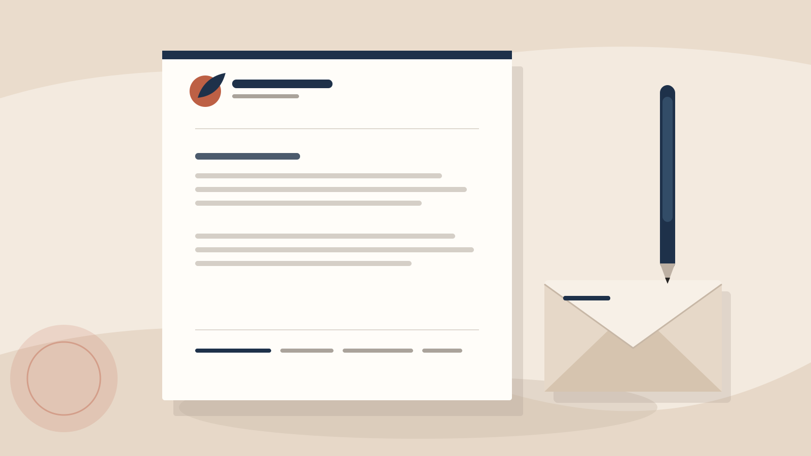
| Header | Small logo, business name, and optionally a short descriptor | Use one side of the header. The logo should support the page, not dominate it. |
| Upper document area | Date, recipient, reference line, and title | Leave a clear gap after the header so the first line does not feel cramped. |
| Main body | The proposal, quote, or letter | This is the largest area of the page. Do not add a large background graphic behind it. |
| Footer | Website, email, phone number, and address if it is useful to the recipient | Use a small, readable type size and a single line or two. |
You can put the logo on the left and the business name on the right, or stack both on one side. What matters is repetition: once you settle on a layout, use the same one on every formal document. If more than one person will prepare those documents, add the choice to your brand guidelines so nobody rebuilds it from memory.
Start with the page size and safe margins
The two sizes you will run into most often are US Letter and A4:
- US Letter is 8.5 × 11 inches (216 × 279 mm).
- A4 is 210 × 297 mm (8.27 × 11.69 inches).
They are close, but not interchangeable. A layout that barely fits on US Letter can shift or clip when printed on A4. If you work with clients in more than one region, make both versions or use the page size your document software applies before you start positioning anything.
Keep your logo, footer, and any rule line at least 0.5 inches (13 mm) from every edge. That is a sensible safe zone for a clean layout. Some office printers cannot print all the way to the edge, so give the footer more room if the test page shows it getting close. The page does not need decoration in those outer margins anyway.
Make the header smaller than you think
The most common letterhead mistake is a logo that is trying to be a poster.
For most one-page documents, a compact horizontal logo or wordmark is enough. It needs to be recognizable when the page is viewed at normal reading size, not from across a room. A thin divider line or one small accent block can help anchor the top of the page, but it is optional.
Avoid putting your full address, five service categories, a slogan, and a row of icons across the header. Contact details belong in the footer. The header gets one job: identify the sender. Once it is crowded, the page feels dated before anyone reads the first paragraph.
Use the right logo file
Keep an SVG version of your logo as the source for the letterhead. SVG is built from shapes rather than pixels, so it stays sharp at the size you need and gives you a clean starting point for print or a digital page. A PNG is useful when the software you are using only accepts image files, but it needs enough resolution for the size you place it at. PNG vs SVG for logos explains the difference in more detail.
Also keep a one-color logo version nearby. A letterhead may be printed in black and white by you, a client, or a copy shop. If the mark only works because two colored shapes are different hues, it can turn muddy on a monochrome print. Testing a logo in black and white is worth doing before you build the page around it.
Do not stretch the logo to fill a space, sharpen a blurry file with a filter, or use a screenshot from your website as the source. If the only logo you can find is small and fuzzy, fix the asset before you start arranging the page.
One layout for digital documents and print
A letterhead used in a PDF does not need a different visual identity from one you print. Use the same header, footer, colors, and type. The difference is practical: a digital document can use links and does not have a printer's unprintable edge, while a printed document needs enough margin for the device that will produce it.
Keep the body of the letter as real text rather than turning the full page into an image. It stays searchable, selectable, and easier to update when the client name or quote changes. For a digital document, check that linked contact details work and that the logo is not blurry at 100% zoom. For print, make a test page at actual size on the printer you expect to use.
That test page catches boring problems before a client does: a footer too close to the edge, a navy that prints nearly black, a light gray line that disappears, or a logo that is much larger on paper than it looked on screen.
What to leave off
Letterhead gets worse with every extra claim you add to it. Skip:
- A large logo watermark behind the body text
- Full-bleed color blocks that eat into the writing area
- Several competing logo versions
- Social icons for accounts you do not actively use
- Tiny contact text that is hard to read when printed
- Decorative fonts for the body copy
- A legal or registration statement unless you know your business needs one
Company-registration and disclosure rules vary by location and industry, so get advice that fits your business if you need required wording. This page is about the layout, not legal stationery requirements.
A quick check before you use it
Open a real proposal or quote in the layout, not just a blank page. Then check the following:
- Does the document still have enough room for a long heading and several paragraphs?
- Can you read the footer without zooming in?
- Does the logo look sharp at normal size?
- Does it still work in black and white?
- Have you printed one page and checked the margins, color, and logo size?
If those answers are yes, it is ready. One page that makes your everyday documents look like they belong to you is plenty. A full stationery system can wait.
Ready to create your logo?
Generate a professional SVG + PNG logo in under 30 seconds.


